Ocean Heat map data is fake! The oceans cant warm. Latent heat of evaporation keeps them cool. Latent heat of evaporation is like alcohol put on your arm prior to drawing blood, The alcohol evaporates and that spot on your arm feels cold. It takes energy from the ocean to evaporate the water for our weather.
Heat maps are fake anyway. NOAA and NASA dont make heat maps. They contract with companies to make them. What is a heat map company going to give the government when it gets data from the government to make the map? A heat map even if they have to eliminate some data to make it “right”.
Comments uploaded for Expert and Govt Review – SROCC Expert and Govt Review
The oceans are not a sink for Atmospheric carbon dioxide.
The NOAA Satellite Altimetry data is not correct. Their recent launch of Jason-3 Satellite has a minimum resolution of 25 mm. They say they are measuring a 3 mm/year rise which is impossible. This data is unreliable.
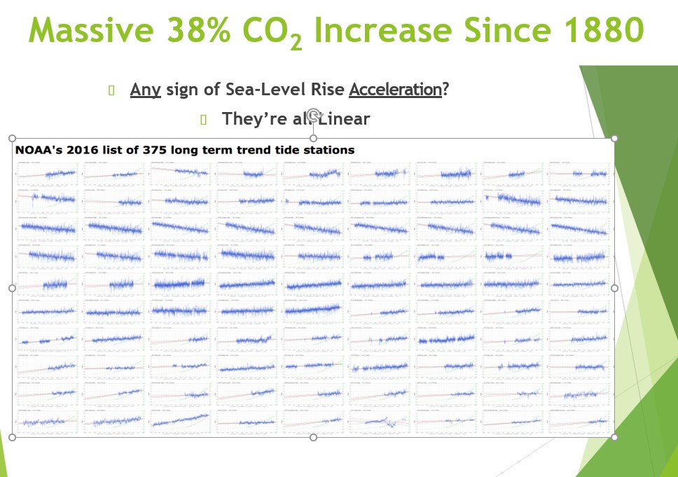
South Beach Oregon tide gauge NOAA station 9435380 is 1.7 mm/yr sea level rise and not accelerating.
Sea Level Change data is unreliable. The satellite they use, (the Jason-3) has a minimum resolution of 25 mm. They say they are measuring a 3mm rise per year by measuring a location every 10 days. When we measure anything below minimum resolution, the data reliability drops exponentially below 50% of the minimum resolution. I know the tide gauges tell the truth and show almost no sea level change “Nowhere on this planet can we find a tide gauge with over a 100 year record that shows a sudden linear change in direction starting in 1992 from 1.1 to 1.4mm/yr. jumping to 2.9 to 3.4mm/yr. per the chart below. Even where violent tectonics intervene, such as Seward Alaska, the rate of change remains consistent in direction and remains linear, before and after the event! “DOI : doi.org/10.33140/JMSRO.02.01.06 The Views of Three Sea Level Specialists Mörner NA, Wysmuller T and Parker A https://www.opastonline.com/jmsro-volume-2-issue-1-year-2019/www.opastonline.com J Mari Scie Res Ocean, 2019 Volume 2 | Issue 1 Tom Wysmuller put together a document which explains the facts. https://cctruth.org/SLRresolution.pdf A Movie will come out in the Theaters which documents the false NOAA data its called Climate Hustle II. I know more than 200 Semiconductor Lithography and over 30 Climate Change Ph D.’s who agree with this. We have had 40 years of Global warming/climate change and the sea level is rising the same as always.
Think about it this way: Take a yardstick. Wrap it with tape so you cant see the markings. Just see the ends. Now in an empty room. Have someone place an object you are unfamiliar with 10 feet from you. See what measurements you write down in 20 seconds. Then take the tape off and measure the object.
The tide gauges however are more accurate and reliable. Soon I will get graphs made for those. Until then you can go to the link below and see the NOAA tide gauges by latitude. Some of them have decreasing seal level. http://www.sealevel.info/MSL_global_trendtable5_L.html The tide gauges show 1.1 mm/yr rise of sea level.
Thomas-Wysmuller shows that sea level rise is NOT accelerating
Juneau Alaska graph. Where the Glaciers are melting back 60 feet. Graph of sea level. The sea level in Juneau is lowering because icebergs under the glaciers which are sticking out from land are melting first. Water expands when frozen and contracts when liquid. Correct Ocean rise by latitude from RAD’s software.
The Nature Journals are fake journals where their Chief Editors are woke and operate on a scientific belief system. I explain this in plenary addresses I give at Climate Change Conferences. Your projections are not based on anything except make-believe. Your historical data in figure 4 is correct and will continue on as it has been for a long time. The actual NOAA sea level rise at Pensacola FL since 1930 is 3.33 mm/yr 300 mm in 90 years!. Increasing but not accelerating! That’s 0.131 inches. That means it will take 8,244 years to increase a foot. Quick Nature. Evacuate Miami now! Nonsense. It’s amazing, isn’t it, how clearly we can see things in perspective when we look at the actual data using the standard scientific method.
Worldwide tide gauges. Some go up some go down. All linear.
That’s almost certainly a Gulf Stream effect. The Gulf Stream hugs the coast from Florida to Cape Hatteras, North Carolina, and variations in the Gulf Stream affect sea-level there (which is to say “here,” since I’m in NC).
The U.S. East Coast has long been known for such sea-level trend fluctuations. Zervas (2009), NOAA Technical Report NOS CO-OPS 053, Sea Level Variations of the United States, 1854 – 2006, reports:
A derived inverse power relationship indicates that 50-60 years of data are required to obtain a trend with a 95% confidence interval of +/- 0.5 mm/yr. This dependence on record length is caused by the
inter-annual variability in the observations. A series of 50-year segments were used to obtain linear MSL trends for the stations with over 80 years of data. None of the stations showed consistently increasing or decreasing 50-year MSL trends, although there was statistically significant multi-decadal variability on the U.S. east coast with higher rates in the 1930s, 1940s and 1950s and lower rates in the 1960s and 1970s.
I suspect that Gulf Stream variations probably caused those earlier east coast sea-level trend variations, as well.
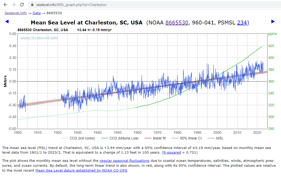
They need to get these scary papers out quickly, because the peak was about November, 2019, as you can see in Charleston’s data:
- https://sealevel.info/MSL_graph.php?id=Charleston
- https://sealevel.info/8665530_Charleston_NC_vs_CO2_thru_2023-02.png
You can see that the sea-level surge ran for about 11 years, from early 2009 to late 2019. Before that was a slight decline of similar duration.
Based on the obvious oscillatory pattern, my guess is that there’ll be little if any sea-level rise there for about the next seven years, and then it will probably “slosh up” again.
Charleston is subsiding, so it sees a bit more sea-level rise than most places. These figures are calculated by doing linear and quadratic regressions on the full measurement record:
- linear trend = 3.435 ±0.190 mm/yr = 13.5 inches / century.
- acceleration = 0.01306 ±0.01207 mm/yr² = no correlation, this is because the range of the data of acceleration is twice that of the acceleration.
An acceleration of 0.01306 mm/yr², if it were to continue for 150 years, would add another 5.8 inches.
Just as there’s always someplace in drought, and always someplace with record rainfall, there’s always someplace with a transient, atypical sea-level trend. A decade ago, this paper made a big splash:
- Sallenger, A., et al. (2012). Hotspot of accelerated sea-level rise on the Atlantic coast of North America. Nature Clim Change 2, 884–888. doi:10.1038/nclimate1597
That paper was about the other half of the U.S. east coast: the part north of Cape Hatteras, NC, and especially New York. Sea-level surged there, shortly before that paper was published:
The peak in NYC’s monthly averaged mean sea-level was March, 2010 — and it hasn’t gotten that high since then:
Like Charleston, if you look at the whole record, rather than just a cherry-picked interval, New York has seen only a very slight, non-worrisome acceleration in sea-level trend.
Updated 4/25/2023